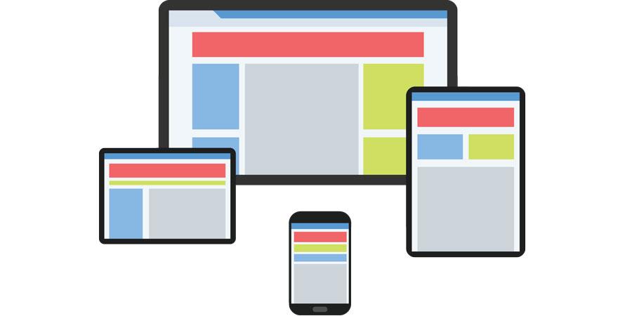
Responsive web design means your website will display correctly on all platforms regardless of screen size.
All websites that WebSolutionZ develop utilise Responsive Design-friendly templates/themes, which means the site resizes automatically according to the device it is viewed on - ie. smartphone, tablet, laptop and desktop friendly. This means we must carefully consider how the website is laid out, and try to take all possible "rearrangements" into account.
In March 2018, Google announced they would start indexing sites "mobile-first". This means if your site doesn't display properly on a smartphone, it will be penalised in Google's rankings. Nobody wants that! Therefore, mobile-first, responsive websites should now be considered an imperative.
For more information on responsive design, please view the following article from our Blog: Responsive Design websites - how they look on different devices